Data visualization
Enhancing videos of sporting competitions using data
Date:
Date:
Changed on 11/03/2025
Watching athletes run, jump swim and compete against each other is no longer enough to quench our thirst for engagement. When we're watching sport on TV, we also want data. Data fills our screens, providing us with context (the names of competitors, flags showing which country they represent, etc.), helping to build suspense (are we going to see a new world record?), analysing performance in real time (e.g. time in possession) and shining a light on technical details (e.g. the number of watts produced).
But this “data visualisation” remains fairly basic. TV channels experiment, keep an eye on what their competitors are doing and adopt certain standards. But they don’t know if viewers actually really appreciate what they get. And these standards haven't been validated scientifically.
What’s more, a whole range of possibilities go practically unused.
Image

Verbatim
You see a lot of static visualisation stuck in one corner of the screen, but few mobile visualisations which follow the athlete around. Then there is the fact that some data that is easy to collect is never used.
Auteur
Poste
Researcher in the AVIZ project-team
“In swimming, we were able to identify more than 20 examples of this” says Petra Isenberg, director of research with the Aviz project team at the Inria Saclay centre.
These forgotten subjects raise a whole host of questions of their own. Which data would be most effective at making a race more appealing? Which data should be displayed, and at what point during the broadcast? How much data is needed to enhance the broadcast without cluttering the screen and spoiling the viewing experience?
“This is a vast field of research”, explains Petra Isenberg. “Our focus is on designing mobile visualisations: what is the best approach? What tools do designers need to work with? We use swimming competitions in our research as we have access to rights-free videos.”
Since 2020, Romain Vuillemot, a researcher at the LIRIS laboratory (CNRS) and a teammate of Petra Isenberg on this subject, has been a participant in NePTUNE, a French National Research Agency (ANR) project designed to help swimming and para swimming coaches improve their preparations for the 2024 Paris Olympics. For this he has been able to use videos from the 2021 French swimming championships in Montpellier, enriched with data on the athletes and their performances.
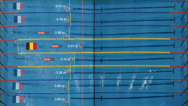
The other benefit to using swimming is that raw footage of competitions is difficult for the uninitiated to make sense of: it’s hard to know who's in which lane, who's leading and who is lapping whom, especially given how regularly swimmers change direction. “It’s a useful case study for evaluating whether or not mobile visualisations help to understand what is happening, tell a story and improve the viewing experience”, explains Romain Vuillemot.
The researchers began by asking swimming enthusiasts which data they would like to see displayed during competitions. Their answers included things like predictions as to whether or not a record might be broken; the average length of a full crawl, butterfly or breaststroke motion; how fast swimmers are swimming; how much of a lead the swimmer in first place has over the rest of the field, and so on.
The research continued alongside specialist designers, who were tasked with coming up with visualisations for the examples given above, using tracing paper placed over a photograph of a pool during a competition. A total of 46 proposals were put forward, taking the form of text, lines, icons and graphics.
But working with photographs as opposed to videos made this a difficult task, prompting the team to develop SwimFlow, a tool for creating data visualisations. As Romain Vuillemot explains, “This was an initial prototype designed to enable us to produce a rough draft of a software program, the goal being to put designers in real-life data visualisation design situations and to gather feedback.”
SwimFlow used footage and data from a competition in Montpellier, with a wide selection of visualisation modes and insertion types (stationary or mobile, location, size, etc.). It also had a feature letting you view data-enhanced videos.
For the designers who took part, discovering their visualisations in real-life conditions proved decisive. “After they had watched them back they made changes to them, adding things or sometimes getting rid of things”, explains Petra Isenberg. “They might have realised, for example, that a graphic would convey more than text, that certain colours got lost in the background image or that they had made a mistake in terms of which way the swimmers were going.”
The team has continued its research using a more advanced version of the software, SwimFlow2. This version lets you configure exactly when data is displayed, depending on what’s happening in the race, including things such as the dive distance just after the start, a reminder of the world record if it looks as though there is a chance it might be broken, showing the gap between two swimmers competing for the win, and so on.
It also features templates, meaning there is no need to recreate visualisations for each competition, making it easier to customise videos for different functions.
“Our long-term goal is to be able to broadcast these visualisations live for the general public”, says Romain Vuillemot. “But we still have to solve the issue of collecting data in real time and incorporating it into broadcasters’ production systems."
Image
Verbatim
videos enhanced with data visualisations can also be used by coaches, by sports federations looking to encourage people to join them, by clubs showing competitions involving their athletes on YouTube, and so on.
Auteur
Poste
Researcher in LIRIS (CNRS)
But different groups have different priorities. For coaches the focus will be on the technical side of things, such as diving distance, speed at a given point or the length of strokes. Federations will want indicators that build suspense - the gap between competitors, a moving bar showing the speed needed to beat a record, etc. - while clubs will want to promote their swimmers using likes, emoticons, and so on.
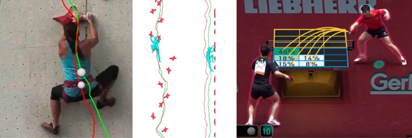
“SwimFlow2 has already attracted a lot of interest from startups and regional swimming leagues”, says Petra Isenberg. “The aim is to improve it and, who knows, to potentially develop a simplified, open source version one day. But significant funding will be required if we are to make this into a product for widespread distribution.” Petra Isenberg also has plans to expand her work on mobile data visualisation to two other sports: table tennis - which she herself plays regularly - and climbing.
*In addition to the CNRS, this laboratory also involves INSA de Lyon, Claude Bernard University Lyon 1, Lumière University Lyon 2 and the École Centrale de Lyon.